

Color plays a defining role in shaping the personality of a kitchen. The right combination enhances brightness, improves visual balance, and creates a welcoming atmosphere for everyday use. Modern kitchen interiors now focus on layered tones, natural textures, and contrast-based palettes that support both function and aesthetics. Choosing the right scheme helps transform even compact kitchens into visually appealing and efficient spaces.
Why Color Combinations Matter in Modern Kitchens
Kitchen colors influence how spacious, clean, and comfortable the room feels. A well-balanced palette improves lighting reflection, highlights cabinetry, and complements countertops and flooring materials.
Strong color planning helps achieve:
- better visual harmony between fixtures and finishes
- improved perception of space in smaller kitchens
- timeless appeal that stays relevant longer
- flexibility when updating decor elements later
Selecting coordinated tones rather than single-color dominance produces a more refined interior result.
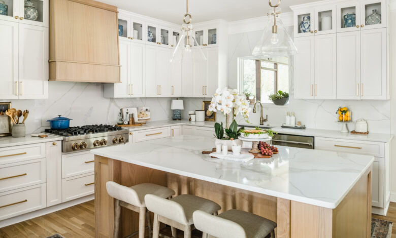
White and Wood for Warm Minimal Elegance
White paired with natural wood creates one of the most dependable kitchen color combinations today. This pairing blends brightness with warmth and suits both compact and large layouts.
Advantages of this combination include:
- improved light reflection across surfaces
- natural texture contrast without visual clutter
- compatibility with most flooring materials
- timeless appearance across design trends
Light oak, walnut, or maple finishes work especially well alongside matte white cabinetry.
Grey and Matte Black for Contemporary Sophistication
Grey and matte black kitchens create a refined and structured look suited for urban homes. This palette emphasizes clean lines and modern fixtures.
Best applications include:
- matte black lower cabinets with grey upper storage
- charcoal countertops paired with lighter wall shades
- black hardware over soft grey cabinetry
Adding under cabinet lighting prevents the darker palette from appearing heavy.
Beige and Cream for Soft Timeless Appeal
Neutral kitchens built around beige and cream tones create calm and balanced interiors. These colors work especially well in family homes where warmth and comfort are priorities.
This combination supports:
- smooth integration with natural stone countertops
- compatibility with metallic finishes
- flexibility for decorative updates
- enhanced brightness without stark contrast
Soft lighting further improves the elegance of this palette.
Blue and White for Fresh Modern Character
Blue paired with white introduces freshness while maintaining visual clarity. It works particularly well in medium sized kitchens needing personality without overcrowding.
Popular pairings include:
- navy base cabinets with white upper storage
- pastel blue island units with white walls
- muted blue backsplashes against white cabinetry
Gloss finishes increase brightness in darker blue tones.
Green and Natural Stone for Nature Inspired Interiors
Green kitchens reflect current design preferences focused on natural influence and calm environments. When combined with stone textures, they produce a grounded and elegant appearance.
Ideal pairings include:
- sage green cabinets with marble surfaces
- olive tones with granite counters
- muted green backsplashes with neutral flooring
These combinations remain visually comfortable even with extended daily use.
Yellow and Grey for Energetic Urban Kitchen
Yellow adds brightness while grey stabilizes the palette. Together they create a lively but controlled kitchen environment suitable for compact layouts.
Effective uses include:
- yellow accent cabinets with grey storage units
- grey countertops paired with muted yellow walls
- yellow seating elements within neutral kitchens
This palette works especially well in spaces with limited natural light.
Two Tone Cabinet Combinations for Depth and Contrast
Layering two cabinet colors instead of using one tone across the kitchen improves visual structure and zoning.
Popular two tone combinations include:
- dark lower cabinets with light upper cabinets
- neutral base units with bold island accents
- wood finishes combined with painted cabinetry
This approach helps create balanced interiors without overwhelming the space.
Matching Countertops and Backsplashes with Color Themes
Countertops and backsplashes should support the cabinet palette rather than compete with it.
Recommended pairing strategies include:
- marble surfaces for neutral kitchens
- quartz countertops for modern contrast themes
- textured ceramic backsplashes for soft palettes
- matte stone finishes for darker cabinetry
Consistent surface coordination strengthens the overall kitchen appearance.
Choosing Finishes That Enhance Color Performance
Finish selection affects how colors appear under different lighting conditions.
Consider using:
- matte finishes for subtle modern kitchens
- satin finishes for balanced reflections
- gloss finishes for compact kitchens needing brightness
Proper finish selection ensures long term visual consistency.
FAQ Section
Which kitchen color combination makes small kitchens look bigger
Light combinations such as white with wood or cream with soft grey help reflect more light and create a spacious appearance.
Are dark kitchen colors suitable for compact spaces
Yes when balanced with lighter upper cabinets and proper lighting dark tones can work effectively even in smaller kitchens.
How do I choose a backsplash color that matches cabinets
Select backsplash shades that either match the cabinet undertone or provide gentle contrast without dominating the visual layout.
Do neutral kitchen colors go out of style quickly
Neutral palettes remain relevant longer because they adapt easily to changing decor preferences and accessories.
Should kitchen wall colors match cabinet colors exactly
Walls should complement cabinet tones rather than match them exactly to maintain visual depth.
What color combinations work best with stainless steel appliances
Grey white navy blue and beige combinations pair well with stainless steel surfaces.
Can bright kitchen colors affect lighting inside the space
Yes brighter tones reflect more light while darker shades absorb it so lighting placement becomes important when using bold palettes.


